Analytics Dashboard
1 Month (August 2022 - September 2022)
Duration
Design Team of 2 (1 UX Designer, 1 Creative Director)
Project Info
Tools Used
Figma, Invision
My Role
UX Designer
persona creation, created low and high fidelity designs, prototype creation, presented design work to client and internal teams
Scope
Overview
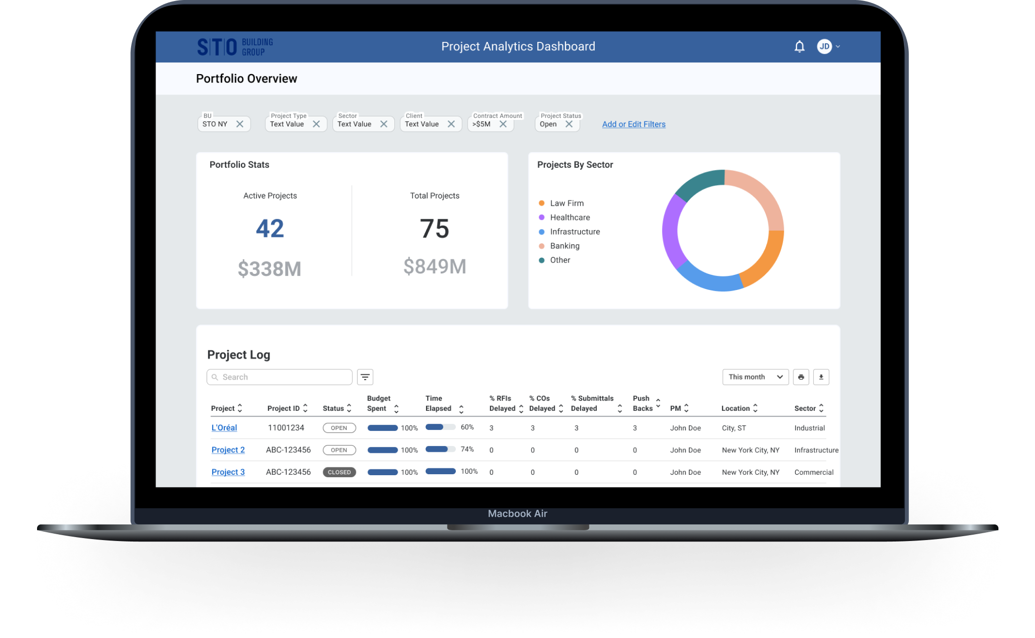
STO Building Group (STOBG) is a family of construction companies. They came to Deloitte looking for help developing an analytics dashboard that would be powered by looker, to allow employees to view key information in one place.
The Problem
Our solution was an analytics dashboard containing a high-level view of widgets and data sets related to the user’s portfolio of projects with an ability to dive deeper into project specifics.
Our Solution
Method of Approach
Defining the Ask
Coming into the project, it was relayed to us that preliminary research had already been done to determine who the users of this product would be and what they need to successfully complete tasks. In order to synthesize this information, I aligned with the broader team to better understand the ask and clearly define who users are, their typical tasks, and the pain points they experience.
Final Designs
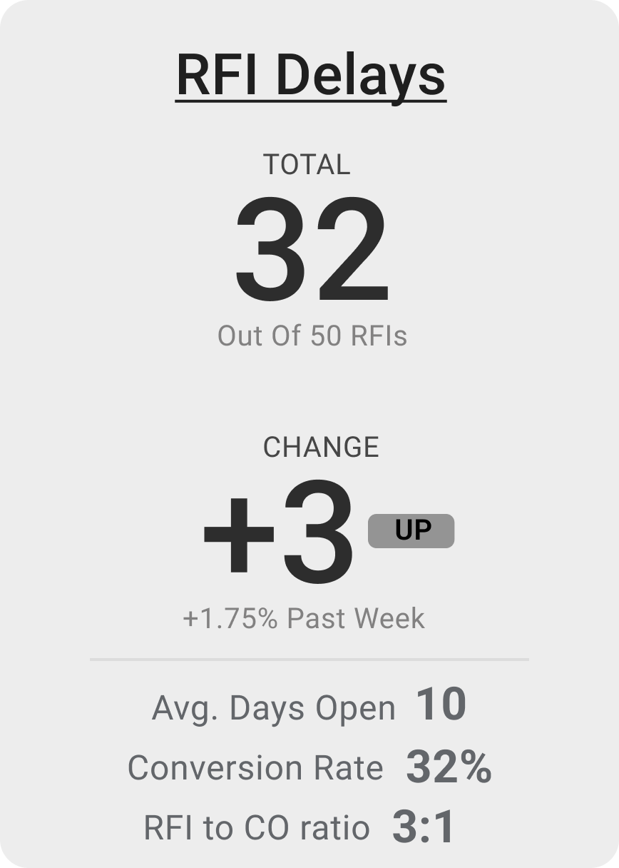
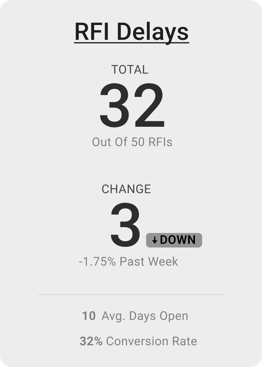
When designing the dashboard, we had regular sessions in order to get a better understanding of what KPIs were important to include and what the best display of these values would be. Because of that, many different explorations of widgets were made, such as this RFI Delay Widget below.
V2
V1
V3
Considerations made:
Total and change are are most critical, we wanted to make the design of those data points hold more weight.
If tech-feasible, we could vary placement of up/down ticker to help users easily identify a state change aside from a change in color.
By desaturating the bottom data points, we focus the users attention to the top 2 data points and allow all other information be secondary.
Final Designs
Since I was the only designer on the project, I was responsible for both low and high fidelity designs for handoff to the client and their UX team. The high fidelity designs are pictured below.
Conclusion
Launch & Takeaways
The team was adamant about getting the project out and testing reactions. After 4 weeks we handed the product off to the client and their UX team to embark on user testing and further iterations. After handoff, I received feedback from a manager on the engagement that the client was “very happy with the progress made on the wireframes and had received really good comments from the user group.”
Launch
Be flexible.


